CSS
margin : 바깥 쪽으로 밀어냄
padding : 안쪽으로 밀어냄
<!DOCTYPE html>
<html lang="en">
  <head>
    <meta charset="UTF-8" />
    <meta name="viewport" content="width=device-width, initial-scale=1.0" />
    <title>Document</title>
    <style>
      div {
        background: yellow;
        width: 300px;
        border: 15px solid navy;
        /* min-height: 200px; */
        /* 최소 높이 설정 */

        padding: 25px 0 0 0;
        margin: 25px;
      }
    </style>
  </head>
  <body>
    <div>
      css3 박스 모델은 content, padding, border, margin으로 구성되어 있다
    </div>
    <footer style="background: maroon">footer 지역입니다</footer>
  </body>
</html>
그림자 옵션
글씨 그림자 : text-shadow
이미지 그림자 : box-shadow
<!DOCTYPE html>
<html lang="en">
  <head>
    <meta charset="UTF-8" />
    <meta name="viewport" content="width=device-width, initial-scale=1.0" />
    <title>Document</title>
    <style>
      .title {
        text-shadow: 10px 10px 15px black;
        font-size: 70pt;
      }
      img {
        padding: 20px;
        margin: 20px;
        width: 200px;
        height: 100px;
      }
      .shadow1 {
        box-shadow: 5px 5px 10px black;
      }
      .shadow2 {
        box-shadow: -5px -5px 10px black;
      }
    </style>
  </head>
  <body>
    <h1 class="title">내용이 들어옵니다~~~</h1>
    <img src="download.jpg" class="shadow1" />
    <img src="download.jpg" class="shadow2" />
  </body>
</html>
배치하기
<!DOCTYPE html>
<html lang="ko">
  <head>
    <meta charset="UTF-8" />
    <meta name="viewport" content="width=device-width, initial-scale=1.0" />
    <title>Document</title>
    <style>
      #wrap {
        width: 50%;
        height: 200px;
        border: 4px solid black;
        margin: auto;
        text-align: center;
        display: flex;
        /* 가로 배치 */
      }
      #wrap div {
        width: 33.333%;
        /* 메인 div 하위의 div 태그들의 위치를 1/3 로 균일하게 */
        /* 적용한다 */
      }
      #wrap div:first-child {
        order: 3;
        /* display:flex 를 적용하면 order 태그로 순서를 적용할 수 있음 */
        /* 첫번째 자식 클래스이지만 순서를 세번째로 */
        background: red;
      }
      #wrap div:nth-child(2) {
        order: 2;
        /* display:flex 를 적용하면 order 태그로 순서를 적용할 수 있음 */
        /* 두번째 자식 클래스이며 순서를 두번째로 */
        background: green;
      }
      #wrap div:nth-child(3) {
        order: 1;
        /* display:flex 를 적용하면 order 태그로 순서를 적용할 수 있음 */
        /* 세번째 자식 클래스이지만 순서를 첫번째로 */
        background: aqua;
      }
    </style>
  </head>
  <body>
    <div id="wrap">
      <div><h1>1</h1></div>
      <div><h1>2</h1></div>
      <div><h1>3</h1></div>
    </div>
  </body>
</html>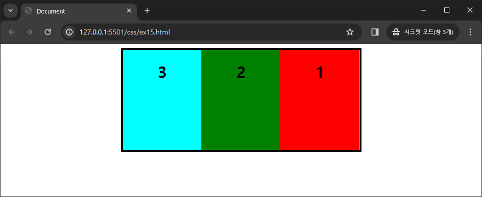
배치하기
<!DOCTYPE html>
<html lang="ko">
  <head>
    <meta charset="UTF-8" />
    <meta name="viewport" content="width=device-width, initial-scale=1.0" />
    <title>Document</title>
    <style>
      #wrap {
        width: 50%;
        height: 200px;
        border: 4px solid black;
        margin: auto;
        text-align: center;
        display: flex;
        /* 가로 배치 */
      }
      #wrap div {
        width: 33.333%;
        /* 메인 div 하위의 div 태그들의 위치를 1/3 로 균일하게 */
        /* 적용한다 */
      }
      .cl01 {
        order: 3;
        /* display:flex 를 적용하면 order 태그로 순서를 적용할 수 있음 */
        /* 첫번째 자식 클래스이지만 순서를 세번째로 */
        background: red;
      }
      .cl02 {
        order: 2;
        /* display:flex 를 적용하면 order 태그로 순서를 적용할 수 있음 */
        /* 두번째 자식 클래스이며 순서를 두번째로 */
        background: green;
        display: flex;
        /* cl02 의 자식 클래스들도 가로 배치로 변경 */
      }
      .cl03 {
        order: 1;
        /* display:flex 를 적용하면 order 태그로 순서를 적용할 수 있음 */
        /* 세번째 자식 클래스이지만 순서를 첫번째로 */
        background: aqua;
      }
      .h01 {
        background: lightblue;
        width: 100%;
      }
      .h02 {
        background: lightcoral;
        width: 100%;
      }
    </style>
  </head>
  <body>
    <div id="wrap">
      <div class="cl01"><h1>1</h1></div>
      <div class="cl02">
        <h1 class="h01">첫번째</h1>
        <h1 class="h02">두번째</h1>
      </div>
      <div class="cl03"><h1>3</h1></div>
    </div>
  </body>
</html>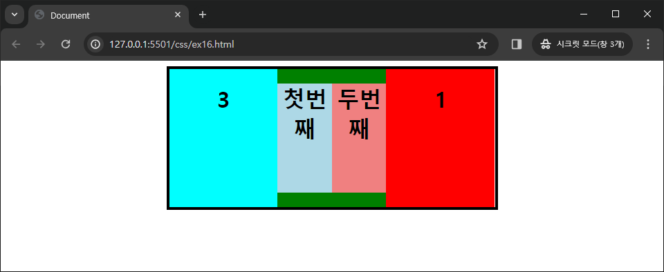
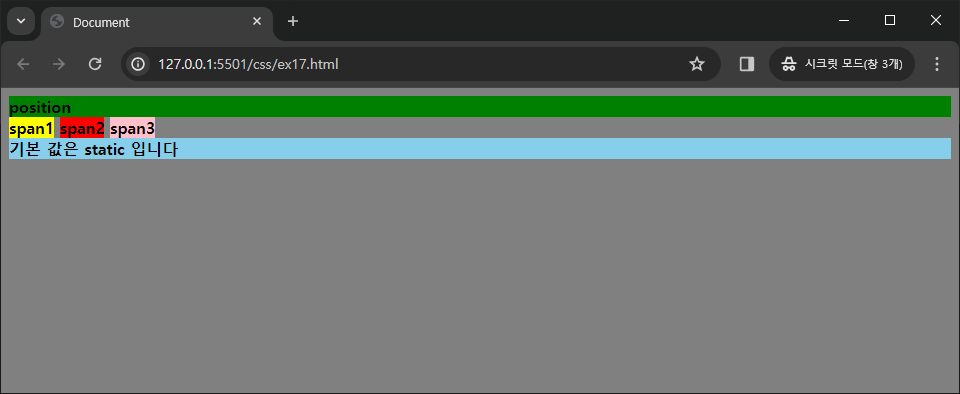
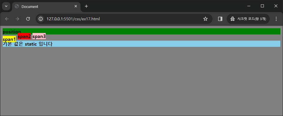
position
- static : 고정, 변경 불가
- relative : static 상태에서 top, right, bottom, left 값으로 위치를 변경 가능
- absolute : 웹 페이지를 기준으로 top, right, bottom, left 값으로 절대 위치를 설정
<!DOCTYPE html>
<html lang="ko">
  <head>
    <meta charset="UTF-8" />
    <meta name="viewport" content="width=device-width, initial-scale=1.0" />
    <title>Document</title>
    <style>
      body {
        font-weight: bold;
        font-size: 12pt;
        background: gray;
      }
      .span1 {
        background: yellow;
        position: absolute;
        top: 5px;
      }
      .span2 {
        background: red;
        position: absolute;
        bottom: 5px;
      }
      .span3 {
        background: pink;
        position: absolute;
        top: -5px;
      }
      div {
        background: skyblue;
      }
    </style>
  </head>
  <body>
    <div style="background: green">position</div>
    <span class="span1">span1</span>
    <span class="span2">span2</span>
    <span class="span3">span3</span>
    <div>기본 값은 static 입니다</div>
  </body>
</html>
style 태그의 각 span 클래스의 코드를 static, relative, absolute 로 설정했을 때 출력물 ↓

position : absolute, fixed
absolute 와 fixed 의 차이점 : fixed 는 스크롤을 내려도 창의 고정 위치에 따라 같이 따라옴
z-index 옵션을 사용하면 위치가 겹쳤을 경우 위에 표시될 것을 index 번호를 부여하여 설정 가능
<!DOCTYPE html>
<html lang="en">
  <head>
    <meta charset="UTF-8" />
    <meta name="viewport" content="width=device-width, initial-scale=1.0" />
    <title>Document</title>
    <style>
      .sp {
        position: static;
        left: 30px;
        background: cyan;
        width: 400px;
        height: 50px;
      }
      .rp1 {
        position: fixed;
        right: 30px;
        top: 10px;
        background: orange;
        width: 400px;
        height: 50px;
        z-index: 1;
        /* 겹쳤을때 위에 더 위에 표시될 것 순서 */
      }
      .rp2 {
        position: absolute;
        right: 60px;
        top: 30px;
        background: lightblue;
        width: 400px;
        height: 50px;
        z-index: 0;
        /* 겹쳤을때 위에 더 위에 표시될 것 순서 */
      }
    </style>
  </head>
  <body>
    <p class="sp">정적 위치 설정</p>

    <p class="rp1">고정 위치(fixed)</p>
    <p class="rp2">절대 위치 설정(absolute)</p>
    <p class="sp">정적 위치 설정</p>
    <p class="sp">정적 위치 설정</p>
  </body>
</html>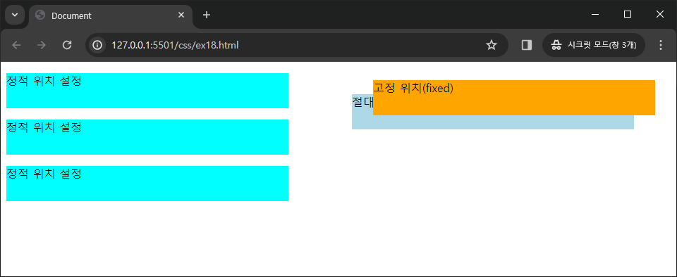
로그인 창 연습
( 통일성은 없음 )
<!DOCTYPE html>
<html lang="ko">
  <head>
    <meta charset="UTF-8" />
    <meta name="viewport" content="width=device-width, initial-scale=1.0" />
    <title>Document</title>
    <style>
      #wrap {
        height: 200px;
        width: 200px;
        margin: auto;
        border: 1px solid lightgray;
        padding: 10px;
        border-radius: 5px;
      }
      .id {
        width: 200px;
        height: 20px;
        font-size: 20px;
        border: none;
        border-bottom: 2px solid darkgray;
        margin: 10px 0;
      }
      .id:focus {
        outline: none;
      }
      .id::-webkit-input-placeholder {
        text-align: center;
        letter-spacing: 5px;
      }
      .pwd {
        border-radius: 5px;
        height: 20px;
        margin-bottom: 10px;
      }
      .btn {
        border-radius: 5px;
        width: 200px;
        height: 30px;
        background: lemonchiffon;
      }
    </style>
  </head>
  <body>
    <div id="wrap">
      <h3 style="text-align: center; border-bottom: 1px solid">
        로그인 페이지
      </h3>
      <form><input class="id" type="text" placeholder="input id" /></form>
      <form>
        <input class="pwd" type="text" placeholder="input password" />
      </form>
      <form><input class="btn" type="submit" value="LOGIN" /></form>
    </div>
  </body>
</html>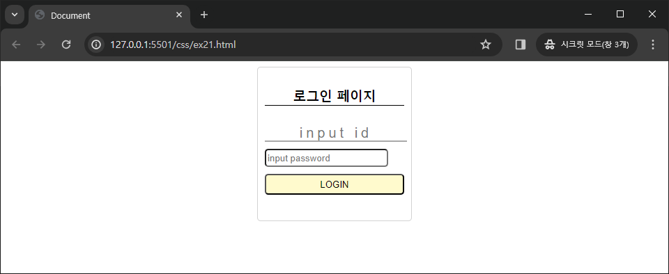
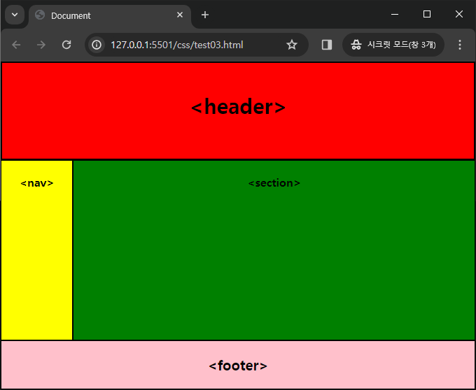
실습 예제
실습 풀이
<!DOCTYPE html>
<html lang="ko">
<head>
<meta charset="UTF-8" />
<meta name="viewport" content="width=device-width, initial-scale=1.0" />
<title>Document</title>
<style>
header {
position: absolute;
top: 0;
left: 0;
right: 0;
bottom: 70%;
border: 2px solid;
background: red;
text-align: center;
font-weight: bold;
font-size: 30px;
padding: 40px 0;
}
div {
position: absolute;
left: 0;
right: 0;
bottom: 15%;
top: 30%;
display: flex;
}
nav {
border: 1px solid;
width: 15%;
text-align: center;
padding: 20px 0;
font-weight: bold;
background: yellow;
}
section {
border: 1px solid;
width: 85%;
text-align: center;
padding: 20px 0;
font-weight: bold;
background: green;
}
footer {
position: absolute;
bottom: 0px;
left: 0px;
right: 0px;
top: 85%;
border: 1px solid;
text-align: center;
font-size: 20px;
font-weight: bold;
background: pink;
padding: 20px 0;
}
</style>
</head>
<body>
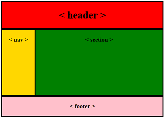
<header><header></header>
<div>
<nav><nav></nav>
<section><section></section>
</div>
<footer><footer></footer>
</body>
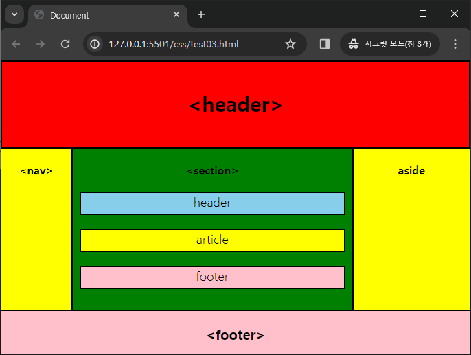
</html>1번 풀이
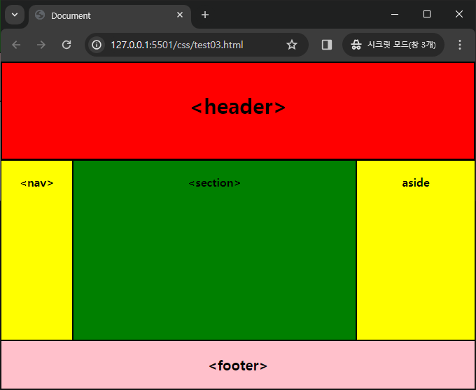
<!DOCTYPE html>
<html lang="ko">
<head>
<meta charset="UTF-8" />
<meta name="viewport" content="width=device-width, initial-scale=1.0" />
<title>Document</title>
<style>
header {
position: absolute;
top: 0;
left: 0;
right: 0;
bottom: 70%;
border: 2px solid;
background: red;
text-align: center;
font-weight: bold;
font-size: 30px;
padding: 40px 0;
}
div {
position: absolute;
left: 0;
right: 0;
bottom: 15%;
top: 30%;
display: flex;
}
nav {
border: 1px solid;
width: 15%;
text-align: center;
padding: 20px 0;
font-weight: bold;
background: yellow;
}
section {
border: 1px solid;
width: 60%;
text-align: center;
padding: 20px 0;
font-weight: bold;
background: green;
}
aside {
width: 25%;
border: 1px solid;
text-align: center;
padding: 20px 0;
font-weight: bold;
background-color: yellow;
}
footer {
position: absolute;
bottom: 0px;
left: 0px;
right: 0px;
top: 85%;
border: 1px solid;
text-align: center;
font-size: 20px;
font-weight: bold;
background: pink;
padding: 20px 0;
}
</style>
</head>
<body>
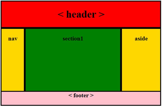
<header><header></header>
<div>
<nav><nav></nav>
<section><section></section>
<aside>aside</aside>
</div>
<footer><footer></footer>
</body>
</html>2번 풀이
<!DOCTYPE html>
<html lang="ko">
<head>
<meta charset="UTF-8" />
<meta name="viewport" content="width=device-width, initial-scale=1.0" />
<title>Document</title>
<style>
header {
position: absolute;
top: 0;
left: 0;
right: 0;
bottom: 70%;
border: 2px solid;
background: red;
text-align: center;
font-weight: bold;
font-size: 30px;
padding: 40px 0;
}
div {
position: absolute;
left: 0;
right: 0;
bottom: 15%;
top: 30%;
display: flex;
}
nav {
border: 1px solid;
width: 15%;
text-align: center;
padding: 20px 0;
font-weight: bold;
background: yellow;
}
section {
border: 1px solid;
width: 60%;
text-align: center;
padding: 20px 0;
font-weight: bold;
background: green;
}
aside {
width: 25%;
border: 1px solid;
text-align: center;
padding: 20px 0;
font-weight: bold;
background-color: yellow;
}
footer {
position: absolute;
bottom: 0px;
left: 0px;
right: 0px;
top: 85%;
border: 1px solid;
text-align: center;
font-size: 20px;
font-weight: bold;
background: pink;
padding: 20px 0;
}
section div {
position: static;
display: block;
}
section > div > header {
position: relative;
margin: 5% 10px;
padding: 0;
height: 30px;
font-weight: 100;
font-size: large;
background-color: skyblue;
}
section > div > article {
border: 2px solid;
position: relative;
margin: 5% 10px;
padding: 0;
height: 30px;
font-weight: 100;
font-size: large;
background-color: yellow;
}
section > div > footer {
border: 2px solid;
position: relative;
margin: 5% 10px;
padding: 0;
height: 30px;
font-weight: 100;
font-size: large;
background-color: pink;
}
</style>
</head>
<body>
<header><header></header>
<div>
<nav><nav></nav>
<section>
<section>
<div>
<header>header</header>
<article>article</article>
<footer>footer</footer>
</div>
</section>
<aside>aside</aside>
</div>
<footer><footer></footer>
</body>
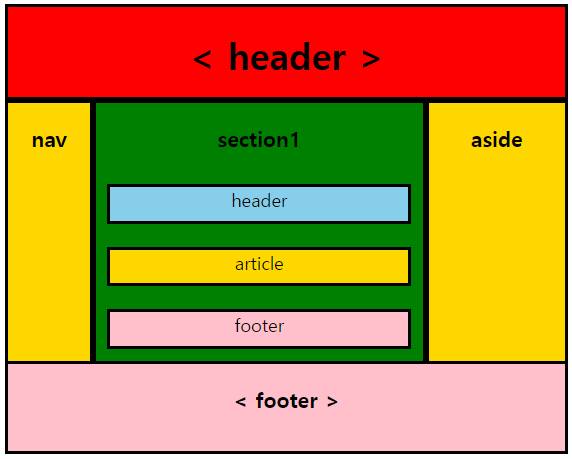
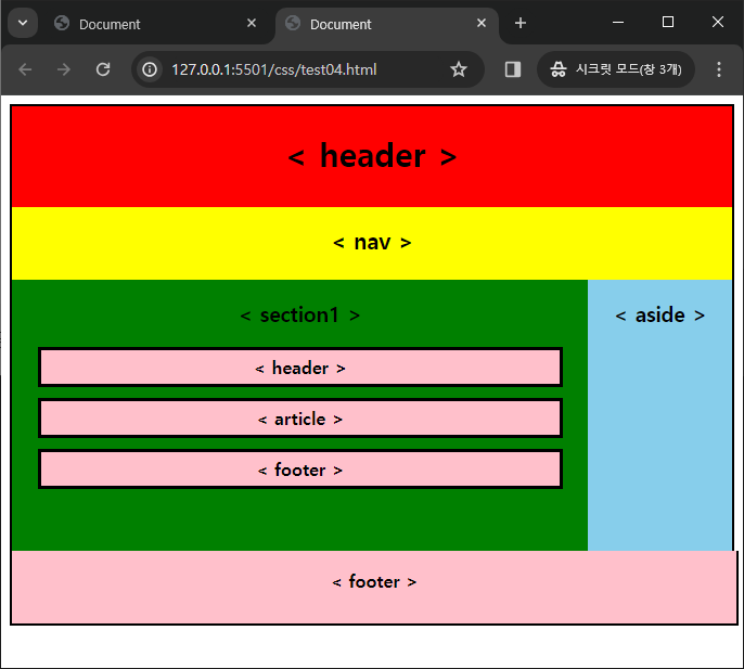
</html>3번 풀이
<!DOCTYPE html>
<html lang="ko">
<head>
<meta charset="UTF-8" />
<meta name="viewport" content="width=device-width, initial-scale=1.0" />
<title>Document</title>
<style>
.mainheader {
position: relative;
border-top: 2px solid;
border-left: 2px solid;
border-right: 2px solid;
background: red;
text-align: center;
font-size: 30px;
font-weight: bold;
height: 70px;
padding-top: 23px;
}
.mainnav {
position: relative;
background: yellow;
border-left: 2px solid;
border-right: 2px solid;
text-align: center;
font-size: 20px;
height: 50px;
padding-top: 17px;
font-weight: bold;
}
.maindiv {
display: flex;
}
.section1 {
position: relative;
width: 80%;
text-align: center;
font-weight: bold;
background: green;
height: 250px;
border-left: 2px solid;
}
aside {
position: relative;
background: skyblue;
width: 20%;
text-align: center;
border-right: 2px solid;
}
.section1 header {
background: pink;
padding: 5px 0;
width: 90%;
margin: auto;
margin-bottom: 10px;
border: 3px solid;
}
.section1 article {
background: pink;
padding: 5px 0;
width: 90%;
margin: auto;
margin-bottom: 10px;
border: 3px solid;
}
.section1 footer {
background: pink;
padding: 5px 0;
width: 90%;
margin: auto;
margin-bottom: 10px;
border: 3px solid;
}
.mainfooter {
text-align: center;
width: 100%;
height: 50px;
padding-top: 17px;
background: pink;
font-weight: bold;
border-right: 2px solid;
border-left: 2px solid;
border-bottom: 2px solid;
}
</style>
</head>
<body>
<header class="mainheader">< header ></header>
<nav class="mainnav">< nav ></nav>
<div class="maindiv">
<section class="section1">
<h3>< section1 ></h3>
<header>< header ></header>
<article>< article ></article>
<footer>< footer ></footer>
</section>
<aside><h3>< aside ></h3></aside>
</div>
<footer class="mainfooter">< footer ></footer>
</body>
</html>4번 풀이
'FE > CSS' 카테고리의 다른 글
| [CSS] CSS 기초 (0) | 2024.03.20 |
|---|